Blog
Learn the secrets of ppt making to create compelling presentations.

Learn the secrets of ppt making to create compelling presentations.


It takes both art and science to make a powerful PowerPoint presentation. Even If you’re presenting to stakeholders, colleagues, or prospective clients, the impression that your audience gets from your slides can be is important.
In this blog we are going over important dos and don’ts to assist you in creating presentations that effectively communicate your content while also being aesthetically pleasing, just like a Professional PPT Presentation Design Agency would.
Using beautiful and complicated fonts can make your audience confused. Never choose fonts that are extremely small or difficult to see since they can divert attention away from your content. Additionally, avoid using full caps, as this could be interpreted as shouting.

Opt for simple, large fonts that enhance readability. Fonts such as Arial, Calibri, and Times New Roman are great options.

In order to keep your font legible on a various devices, make sure it is always at least 28 points in size,Any PowerPoint Presentation Designer Agency would recommend it.
To preserve visual harmony, try not to use too many different font sizes, styles and colors on a single slide, even though they can be attention grabbing.

A lot of Confusion can result from underlining since it can give the impression that the text is a hyperlink. It also frequently makes text more difficult to read.
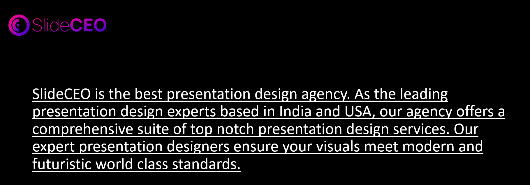
Instead of underlining, Use bold or italic styles to highlight key points without sacrificing clarity.
ps: this is a technique used by the Best Presentation Design Agency to keep slides clean and professional.
Refrain from packing your slides with too much information. Overloading your audience with content might be detrimental.
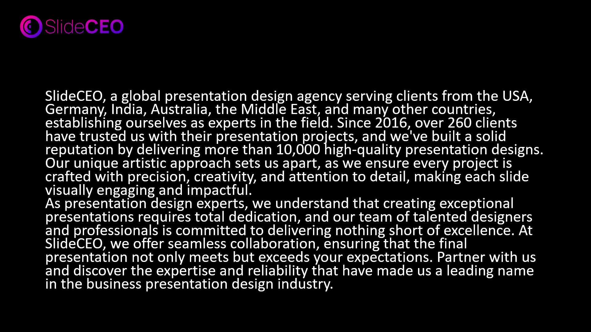
Stick to the 5 line rule: limit your text to no more than five lines per slide, and concentrate on a single concept to keep your audience interested. Presentation companies like us stress the importance of clear messaging in PowerPoint slides.
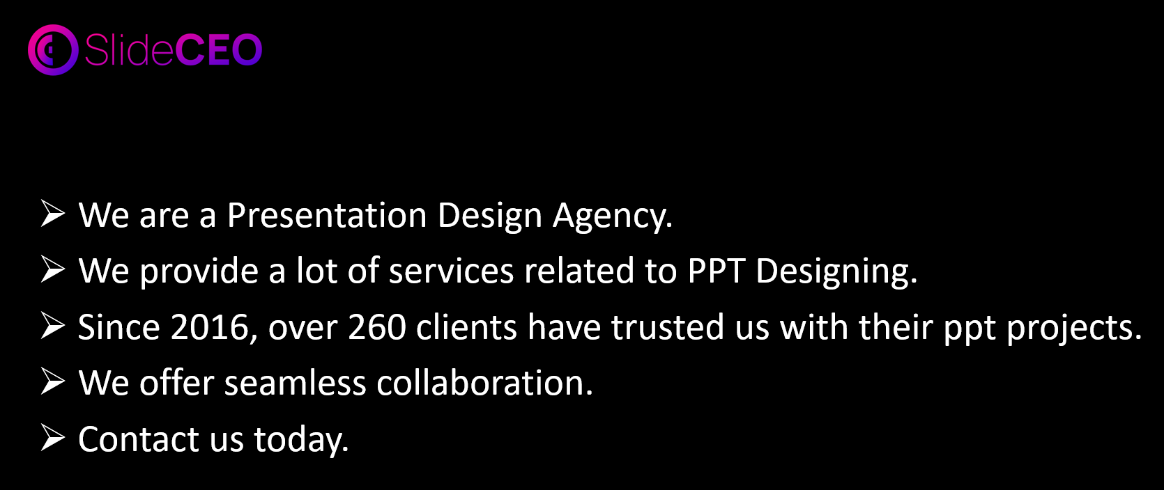
Too many images or unrelated graphics can dilute your message.
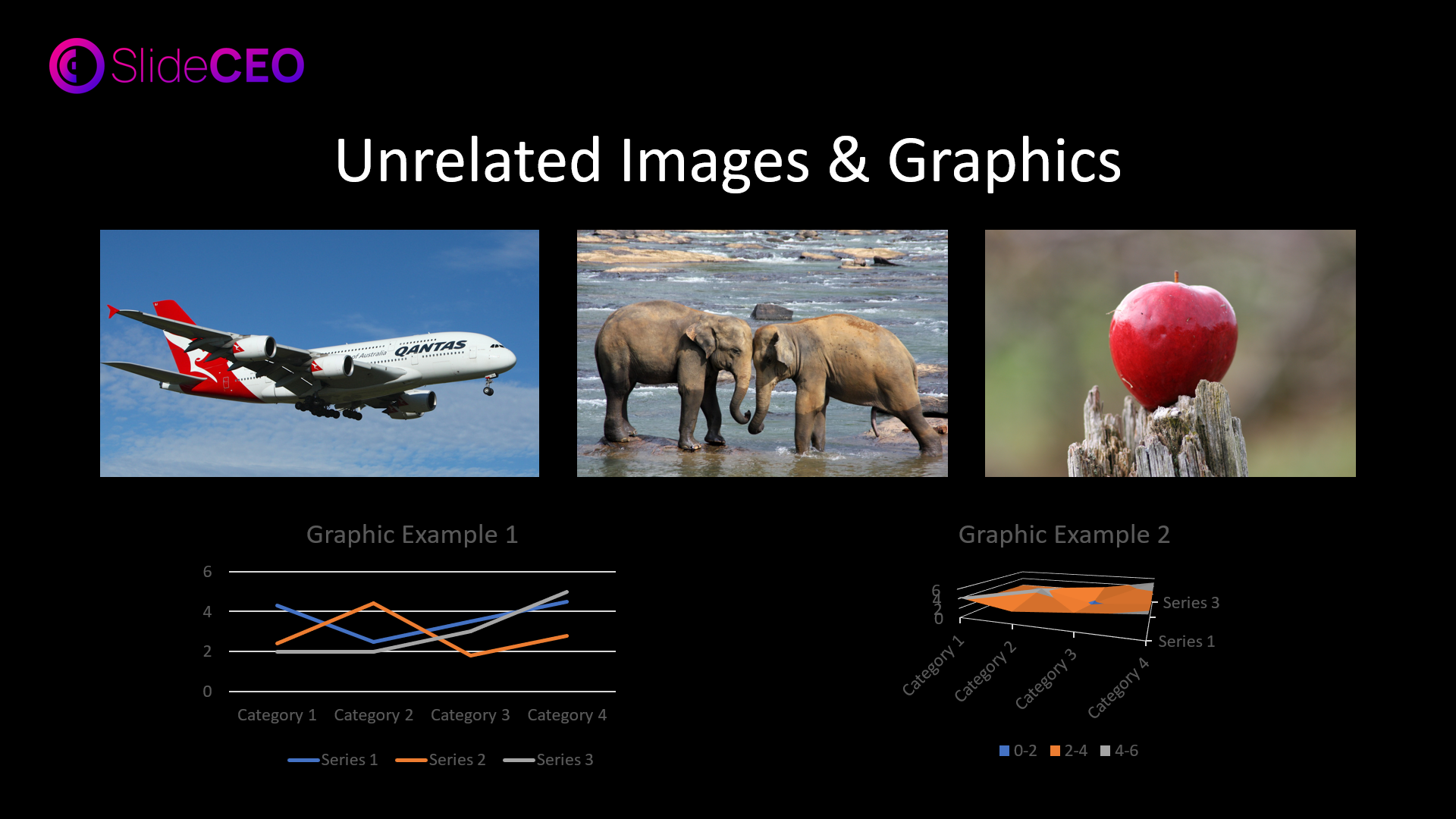
Select one or two photos that strengthen your message and go well with your content. This targeted strategy ensures clarity, a hallmark of any Presentation Design Agency offering PowerPoint presentation services.
Keep your graphics simple and uncomplicated to avoid confusing your readers..
To improve the presentation’s overall effect, choose graphics that are clear and simple to interpret.
Although using a lot of effects, sounds, and animations might make your presentation more engaging, they can also become annoying.
Animations should only be used when absolutely essential, and sounds should support rather than distract from your message. The best PowerPoint presentation services balance functionality with creativity.
A Composite background may rival with your message, making it harder for listeners to concentrate.

Rather, go for a simple yet effective background that draws attention to your content and gives it a polished appearance.

Don’t use color schemes that are difficult to read or that mix together.
To make sure that your content shines out against the background for best readability, choose colors that create a sharp contrast.
Avoid using too many bullet points and alignment errors. A slide with too many bullets can look chaotic.
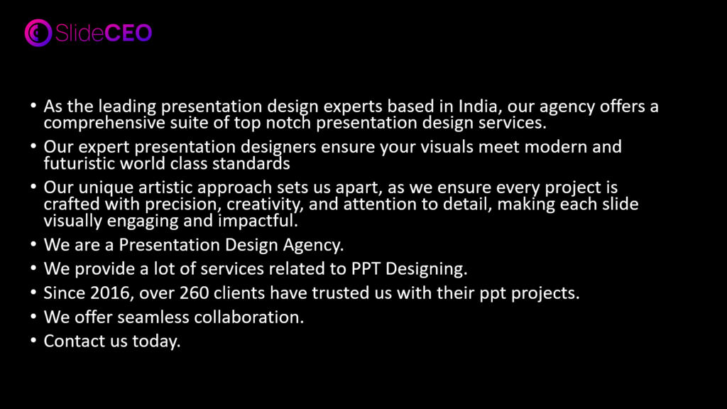
Don’t use more than four or five bullets per slide. To keep it short and to the point, place the bullets on the left and use no more than five words each line.
Always make sure that the text, background, animations, and colors on your slides are all consistent at all times. This is due to the fact that maintaining consistency will show off your professionalism and improve the effectiveness of your message.
Always check that everything is accurate and double check your spelling.
Familiarize yourself with your slides and practice delivering your message confidently.
By following these do’s and don’ts, you are on the right track to creating PowerPoint presentations that truly entertains your audience and communicate your message clearly. But honestly, why not leave it to the professionals if you want to truly step it up?
At SlideCEO, we’re one of the top presentation design agencies in both India and the USA, and we’ve got over 8 years of experience helping clients just like you. If you need a polished corporate deck, an investor pitch that wows, or marketing creatives that stand out, we’ve got you covered in all aspects.
We’ve worked with MNCs, so we do actually know a thing or two about understanding and meeting our clients’ exact needs down to the smallest details like brand guidelines and communication style. Our expert presentation designers can handle even the most complex projects, making us a trusted name in presentation design outsourcing.
Our main goal? To make sure every slide not only looks great but also delivers your message loud and clear.
So, if you’re ready to turn your presentations into effective tools that generate success, Contact Us! Let it be that you’re presenting to a room full of stakeholders or pitching to potential investors, SlideCEO, as a top PowerPoint Presentation Designer Agency can definitely help you leave an impression that lasts. What are you waiting for! Get in touch with us today, and let’s see how we can take your presentations to the next level!
Enjoyed the read? Click here to check our our blogs similar to these.